Fact File: Calculating the Illusive Size of “Mr. Market”
Posted by Jason Apollo Voss on Sep 10, 2012 in Best of the Blog, Blog | 0 commentsWhen it comes to explaining the equity market’s mysterious day-to-day moves, the financial media love nothing more than a convenient explanation. “Today ‘the market’ was up . . . ” or “Investors ran for the exits today . . . ” are common refrains. But what or who, exactly, is “The Market”? Which investors? What is implied, but never fully explored, is that there somehow exists a consensus among all investors about how a given day’s news is discounted.
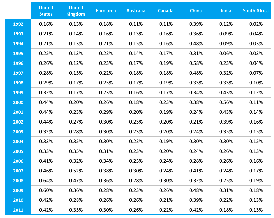
Can one day’s worth of trading activity be legitimately generalized to represent the opinion of all investors? Using turnover ratio data provided by the World Bank for key domestic equity markets, along with the knowledge that there are, on average, 251.6165 trading days in a given year, I analyzed two decades worth of data to arrive at a time-series showing the average daily number of traded shares outstanding in eight markets.

Sources: CFA Institute, World Bank. Note: Turnover data must be uncompounded to back out the average daily number of traded shares outstanding.
So what can we learn?
For starters, the average percentage of the market trading daily over the last twenty years reached a crescendo in the United States in 2008 — at just 0.64%. Yet this represents a turnover ratio of a whopping 404.07%. The year 2008 also marked the global peak of trading activity, with 0.35% of all shares outstanding in all eight markets trading each day.
In each year subsequent to the peak of 2008, the number of shares outstanding that are trading has dropped each year. Even our friends in the financial media would agree that a peak figure of shares trading per day of 0.64% is surprisingly low. After all, when we listen to the day’s news and trading activity is presented as “The Market,” the perception is of a large consensus of investors all discounting news in the same way — not a mere fraction of less than 1% of investors.
Also of interest in the data is the gradual buildup of trading froth during the dot-com era, the subsequent decline, and then a new buildup during the real estate bubble, which, as we all well know, also declined. This suggests that one way of tracking whether or not markets are in the midst of the bubble is to see if the average percentage of the market that trades daily is rising.
Originally published on CFA Institute’s Enterprising Investor.
